Learning CSS with Less - The CSS box model
Learning CSS with Less - The CSS box model

A few weeks ago we integrated into our Technical Blog section a new project that Andrei, a great developer in our community, wanted to share with all of us. Now, the project consists of a series of courses created by Andrei with a lot of passion and dedication, giving from his knowledge gathered during years of work and sleepless nights the chance to learn, grow and become our best version in the future.
Now let's discover the next part of the course "Learning CSS with Less - The CSS box model":
- Topics of discussion
- Understanding the CSS box model
1. Topics of discussion
In this tutorial, we are going to talk about the CSS box model, which will clear up a lot of things. So, let's have some fun.
2. Understanding the CSS box model
As you may have figured it out, CSS programming is used to style different elements from your webpage. Of course, most webpages have more than one element inside them. And in order to understand how CSS affects an element, it's important to be able to view each element from a webpage as a box, containing something inside it.
Take this website for example. The tutorial you are currently viewing is, of course, a web page of its own. And as you can see, this page has a bunch of very distinct elements. We have the course image, the course items, and the tutorial content, alongside the page header.
Each and every one of these elements can be viewed as a box that contains something inside of it. The header box contains the company logo. The course image box contains the cover photo for the course and so on.
So, why is being capable of viewing elements as boxes so important? Because it helps you understand how CSS rules impact an element and how elements interact with one another on a page. Basically, an abstract representation of any HTML element will look like this:
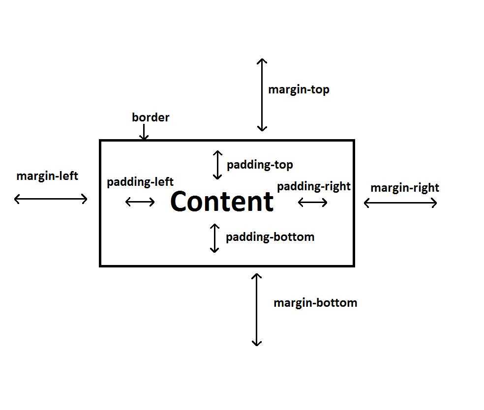
Basically, each element is defined by the following basic components:
- content - what the element contains inside it; could be anything from text to images
- padding - the distance between the content located inside the element and the border of the element
- border - designates where the element starts and ends; basically, it is used to delimit the area occupied by an element in a web page; it is not necessary for it to be visible
- margin - the difference between two elements located on the same web page
As you can see, we have padding and margin values for all possible directions of an element. The values for them can be different if you want. Let's modify our styles.less file. Here is how you set paddings and margins for your elements:
.title {

  color: black;

  font-size: 14px;

  font-family: Arial;


  padding-top: 10px;

  margin-bottom: 10px;

}


.main-title {

  color: blue;

  font-size: 24px;

  padding: 15px;

}


.secondary-title {

  color: red;

  font-size: 20px;

  padding-left: 15px;

}
You can also have different borders if you like, in a similar fashion. On top of it, each border can have a radius applied to it by using the border-radius CSS property. The syntax for adding borders is a bit different though:
.title {

  color: black;

  font-size: 14px;

  font-family: Arial;


  padding-top: 10px;

  margin-bottom: 10px;

  border: 1px solid black;

  border-radius: 3px;

}


.main-title {

  color: blue;

  font-size: 24px;

  padding: 15px;

  border-color: blue;

}


.secondary-title {

  color: red;

  font-size: 20px;

  padding-left: 15px;

  border-color: red;

  border-style: dotted;

}
Don't forget to compile your less code:
lessc styles.less styles.cssAside from what we see here, there are some other ways in which you can change the values for margins, paddings, and borders. We will now go through all possibilities. Let's start with margins:
- margin: value - in this form, the value you associate to the margin property gets set to all margins (top, right, bottom and left)
- margin: top_bottom_value left_right_value - in this way of writing, we supply two values to the margin property; the first one is the value for margin-top and margin-bottom while the second one is the value for margin-left and margin-right
- margin: top_value right_left_value bottom_value - somewhat similar to the one above, only this time we can supply different values for margin-top and margin-bottom
- margin: top_value right_value bottom_value left_value - in this form,we supply all the values in one go
- margin-position: value - this is a property used to set the margin for a certain direction of the element; the position can be one of 4 possibilities: top, right, bottom, left
Padding values can be supplied in a similar fashion:
- padding: value - in this form, the value you associate to the padding property gets set to all paddings (top, right, bottom and left)
- padding: top_bottom_value left_right_value - in this way of writing, we supply two values to the padding property; the first one is the value for padding-top and padding-bottom while the second one is the value for padding-left and padding-right
- padding: top_value right_left_value bottom_value - somewhat similar to the one above, only this time we can supply different values for padding-top and padding-bottom
- padding: top_value right_value bottom_value left_value- in this form,we supply all the values in one go
- padding-position: value - this is a property used to set the padding for a certain direction of the element; the position can be one of 4 possibilities: top, right, bottom, left
With borders, things tend to get a little trickier. Here are all the possibilities for settings borders and border-radius:
- border: size style color - this way of writing allows you to set all the possible properties of a border; style determines how the border looks: solid, dotted, etc.; the values apply to all borders of the element (top, right, bottom, left)
- border-property: value - this CSS property allows you to change the size, style or color for all borders of an element
- border-position-property: value - similar to the one above, only this time you change the value for a certain border of the element (top, right, bottom, left)
As for border-radius, the possibilities are the following:
- border-radius: value - this way of writing allows you to set the border-radius for all corners of an element
- border-position-left/right-radius - allows you to set the radius for a certain corner of an element
And that about covers it for this tutorial. In the next one, we will discuss display types and we will learn about the width and height of an element.