Learning CSS with Less - The flexbox model explained
Learning CSS with Less - The flexbox model explained

Online learning helps individuals become self-didacts, going against the pedagogy of most traditional educational systems. It offers the chance to have great results for lower costs and sometimes for no costs at all (take as an example the series of courses "Learning CSS with Less" that Andrei, a member of our community created and which he shares with us all). Despite these, online learning has many other advantages. Education may have several purposes, and online courses help to fulfill it. Some even say that e-learning can revolutionize education as it provides new opportunities for traditional learning.
Aligned with this vision, a new part of this series comes to you - this time the main theme we focus on is "The flexbox model explained".
- Topics of discussion
- Flexbox explained
1. Topics of discussion
In this tutorial, we are going to take a look at what is known as flex display or flexbox. So, let's have some fun.
2. Flexbox explained
Flexbox is a sort of module in CSS, containing a bunch of properties, that allows for a more efficient way of displaying elements inside a container, even when the dimensions of those.elements are unknown. Basically, it provides a way to position elements dynamically, regardless of their size.
This display model requires you to use a container element, usually a div, that sets its display property to the flex or inline-flex values. The child elements of that div will then be arranged inside of their parent container based on other properties. And trust me, there are a lot of them.
Before we go into properties though, we need to talk about some technical terms and aspects regarding this display model. And for that, we need to take a look at my amazing drawing skills once again:
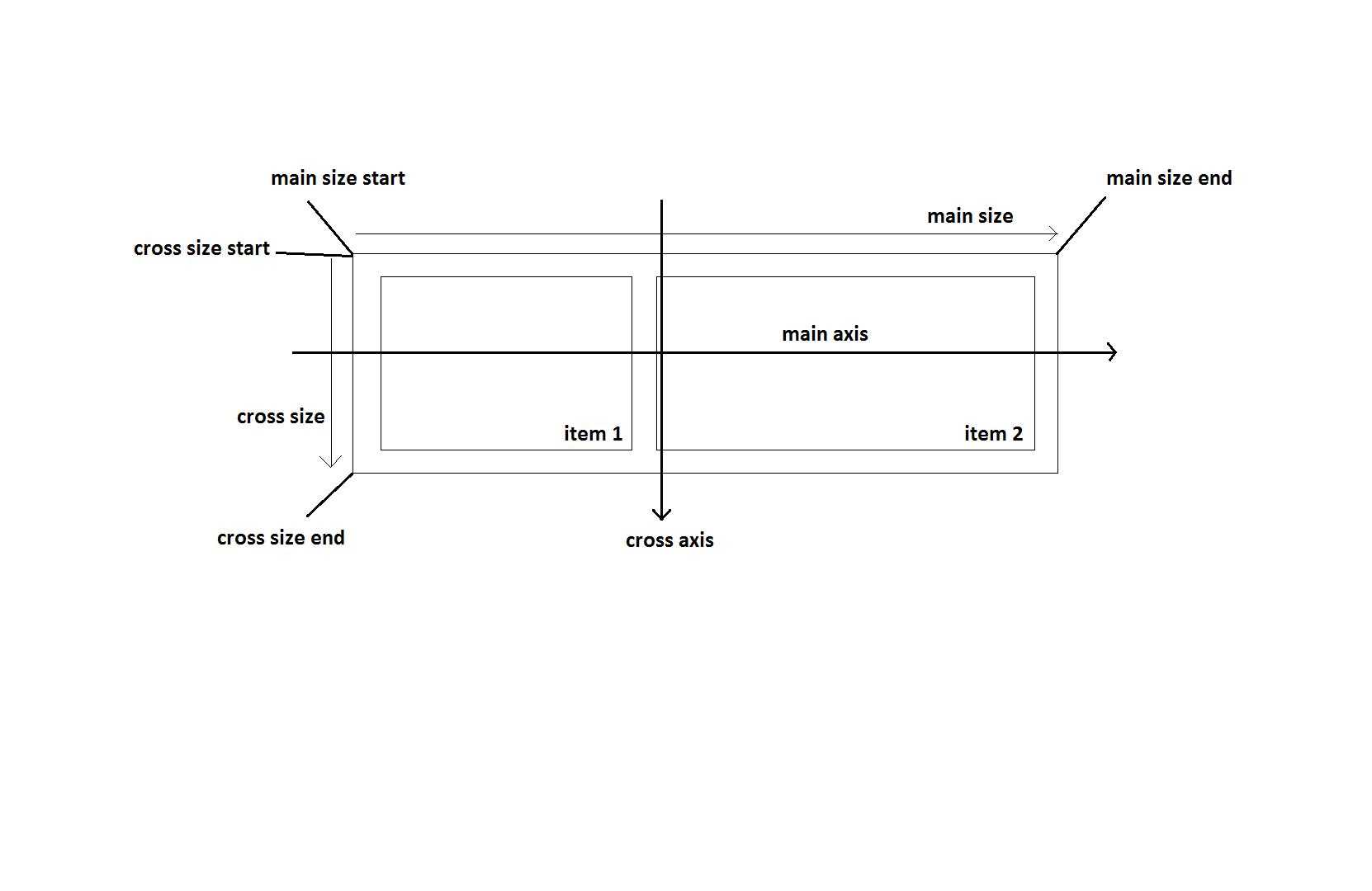
As you can see, there are a lot of things in that picture. The main axis and cross axis are defined by the flex direction defined on the parent element. In the example above, we are using row as the flex-direction value, which is the default value. We'll get into more details in a minute.
The main size and cross size are also dependent on the flex direction. As you can see, for the default value, they basically refer to the width and the height of the flex container. The items inside the main container may also be referred to as flex items since we will use a property on them that helps us define how much of the size is reserved for each element.
Now that we have that out of the way, let's check out some CSS properties related to flexbox. We're going to start off with the properties associated to the parent element:
- display: flex; - this property is required in order to be able to implement the flexbox model
- flex-direction - determines the direction of the main and cross axes, as well as the the main and cross sizesrow or row-reverse - when using these values, the main axis is horizontal, meaning the items will be placed and modified to fit horizontally; when using row-reverse, the only difference is that the items are going to be aligned and positioned starting from the right side of the screen
column or column-reverse - when using these values, the main axis is vertical, meaning the items will be placed and modified to fit vertically; when using column-reverse, the only difference is that the items are going to be aligned and positioned starting from the bottom side of the screen
- flex-wrap - determines how the flex items wrap inside an elementnowrap - the default value, which when used, attempts to fit everything on one line
wrap - the flex items will wrap on multiple lines, from top to bottom
wrap-reverse - the flex items will wrap on multiple lines, from bottom to top this time around
- flex-flow: flex-direction flex-wrap; - shorthand property for the two above
- justify-content - this property is used to determine how the extra space is distributed among elementsflex-start - the default value, in which elements are placed one after the other at the start of the flex direction
flex-end - items are placed one after the other at the end of the flex direction
start - items are placed at the start of the writing-mode direction; writing-mode is a property that determines how the text is placed on a page; the default value is vertical-rl, which means the text is to be displayed in a vertical fashion and is read from right to left
end - items are placed at the end of the writing-mode direction
left/right - items will be placed on the left or right edge of the container; if the flex-direction is one of the reverse values though, they will behave like start/end respectively
center - the items will be centered along the line, with the remaining space being evenly split on the left and right side
space-between - items will be evenly distributed along the main axis line, with the first and last items being placed on the edges of the parent container
space-around - the items are placed evenly on the main axis line, while making sure that the space around them is equal
space-evenly - items are placed in a manner that allows the space between them and the space between an item and the edges of the container is the same
- align-items - this property is used to define how items behave along the cross axisstretch - the default value, makes the items stretch to fill the container; it will take into account the minimum and maximum widths defined on the container, if any
flex-start / start / self-start - these values are used to place the items at the beginning of the cross axis; the difference between them is based on the flex-direction and writing-mode values, so play around with different values to see the difference
flex-end / end / self-end - these values are used to place the items at the end of the cross axis
center - items will be centered along the cross axis
baseline - items are placed in a manner that allows their baselines to be aligned
- align-content - this property is used to align the lines inside flex containerstretch - the default value, in which lines stretch to occupy the entirety of the container
flex-start / start - as you might expect, the lines will be placed at the start of the container; flex-start has a wider browser support and is preferred; flex-start uses flex-direction to determine where the start is while start determines said start by using writing-mode
flex-end / end - similar to the one above, only it places the lines at the end of the container
center - lines will be centered in the container
space-between / space-around / space-evenly - similar to the ones above in justify-content, with the only difference being that the rules apply to the lines of the container rather than individual items
Note that there are also two keywords here, safe and unsafe that can be added after each value mentioned above, starting form justify-content. If you use safe, it means that the browser will make sure to render elements so that none of them become inaccesible (in other words, you may be unable to scroll to an element) due to too much stretching. Using unsafe will basically tell the browser to apply all the rules you have defined, regardless of the outcome.
Too much information? Don't worry, we only have 10 zillion more properties to go through. As I have mentioned, the ones above are used on the parent container. It's now time to look at the properties which we can use on the flex items which will be placed inside the parent flex container:
- order: integer; - determines the order in which flex items appear inside the flex container; the default is 0, but you can change it based on your needs
- flex-grow: integer >= 0; - determines a proportion of space which the flex item is going to fill; the default value is 0; if all flex items have a value of 1 for this property, then the remaining space in the container will be equally distributed to all children; if one item has a higher number for this property, then it will occupy more space; straightforward, right?
- flex-shrink: integer >= 0; - gives a flex item the ability to shrink, if necessary
- flex-basis: length; - determines the default size of an element before the remaining space is distributed; the default value is auto, which looks at the width and height values for the element; you can also use actual values such as 10%
- flex: flex-grow flex-shrink flex-basis; - shorthand property for the ones above; default is 0 1 auto
- align-self - allows you to override the value defined in align-items for a single flex item; the values are the same ones from align-items as a result
Here are some code examples to get you started. First off, the HTML:
Item 1
Item 2
Item 3
And here is the CSS code:
.flex-container {

  display: flex;

  flex-flow: row wrap;

  justify-content: space-evenly;

  align-items: stretch;

  align-content: center;

  .flex-item {

    border: 1px solid black;

    padding: 20px;

    flex: 1 1 auto;

    max-width: 200px;

  }

}
Don't forget, this is Less CSS, which needs to be compiled. I am putting this as a reminder from time to time if there are some people stumbling upon this website in search for solutions.
And yeah, that about covers it for this tutorial. Flexbox is a really powerful tool for CSS display issues, so make sure you play around with these until you get the hang of it. In the next tutorial, we are going to take a look at the difference between pixel and percentage values and relative values such as the ones measured in rem. See you then.